The Chart widget displays quantitative attributes from a data source as a graphical representation. It allows end users to visualize and observe possible patterns and trends from raw data.
Currently, you can choose from bar, column, line, area, scatter plot, and pie charts. Depending on the category type that you choose when configuring the widget, the chart can represent the statistic value of fields for aggregated groups or the statistics of all values for specific fields.
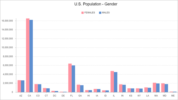
Bar, column, line, and area charts are all series charts, which rely on a series of data to render the display. A data series is a set of data that is displayed on a chart. You can think of a series as an array of values based on the attribute. Each instance in the array is a data point. When plotted on a chart, each data point has a shape. One or more series can be displayed at a time in a series chart. For example, a chart can show the population of different genders in each U.S. state. The female population for each state is a series, and the male population of each state is another series. Each population of a state is a data point in that series.

Pie charts express part-to-whole relationships in data. Each slice represents one component and all slices added together equal the whole. Each slice is a data point that illustrates numerical proportion to the whole.
Scatter plots use points plotted on a graph to show the relationship between two variables.
Examples
Use this widget to support app design requirements such as the following:
- You want to show statistic graphics for a feature layer.
- You want to analyze and visualize data patterns.
- You want to compare feature attributes graphically.
Usage notes
The widget requires a data source. You can use the chart widget on a page with or without a displayed map. After selecting a data source, you select a chart template to start with a specific chart type.
The data source for a chart can be one of the following:
- Operational layers, including a feature layer or scene layer in an existing map or added from a service
- Tables from a map, including a related table
- Output data source of another widget, such as query result of the Query widget
Settings
The Chart widget includes the following settings:
- Data source—Select source data with attributes to analyze in the Chart widget. In the data view settings, you can filter the data to restrict what appears in the widget, sort the data to display features in a particular order, or limit the number of features.
- Chart
type—Select a chart type using a
template to start with that matches how you want to present the
data analysis.
- Use a bar chart to summarize and compare categorical data. A column chart is a vertical bar chart.
- Use a line chart to visualize change over a continuous range, such as time or distance. An area chart has a pattern similar to line charts but is ideal for indicating a change among different datasets to show how values develop over time.
- Use a pie chart to illustrate proportions for categorical or nominal data, either in a sliced pie or donut style.
- Use a scatter plot to show the relationship between two sets of data by plotting points on a graph.
- Data—Define how to generate the data series for
the chart by choosing a category type and configuring which data
attributes to visualize and how to present them.
- Category type—Options vary based on category.
- By group—Display values by category, depicting
statistical values of one or multiple fields for each
category.
- Category field—Define the attribute field from which chart categories are generated.
- Statistics—Calculate the statistical values for the specified number fields. Methods include count, sum, average, minimum, and maximum.
- Number Fields—Select one or multiple fields to analyze.
- By field—Display attribute values as charts, depicting statistical values of all features
or records for a specified field or fields.
- Statistics—Calculate the statistical values for the specified number fields. Methods include sum, average, minimum, and maximum.
- Number Fields—Select one or multiple fields for which to calculate the statistics.
- By group—Display values by category, depicting
statistical values of one or multiple fields for each
category.
- Variables (scatter plots only)—Choose which numerical attributes to display on the axes. Select an X-axis number and Y-axis number.
- Sort by—Sort the chart by values or category name, in ascending or descending order.
- Maximum categories—Specify the maximum categories to display in the chart.
- Category type—Options vary based on category.
- Series (unavailable for pie charts and scatter plots)—Change the stacking type, symbols, and labels
of the data series.
- Stacking—Group series of the same type side by side, stacked, or 100 percent stacked.
- Value label—Display the value label on each series symbol.
- For each series, you can edit its symbol style and the series label (series label distinguishes each series when the legend is enabled).
- For line and area charts, you can display points for each statistic value and edit the point symbol style.
- Axes (unavailable for pie charts)—Customize the properties of the category axis and
value axis.
- Category axis (X axis for scatter plots)
- Axis title—Provide a title for the category axis.
- Axis
label
- Character limit—Specify how many characters to display for each category label.
- Alignment—Specify how to position and align the category labels according to the axis scale.
- Axis grid—Display vertical grids.
- Value axis (Y axis for scatter plots)
- Value range—Customize axis scale by indicating the minimum and maximum.
- Axis title—Provide a title for the value axis.
- Axis label
- Decimal—Specify how many decimals to display for each value scale.
- Notation—Select the format for displaying numeric values by choosing from Standard, Compact, Scientific, and Engineering.
- Show thousand separator—Show separators for values over one thousand.
- Axis grid—Display horizontal grids.
- Category axis (X axis for scatter plots)
- Slices (pie charts only)—Customize the properties of the pie slices.
- Value label—Display the value label on each slice in the chart.
- Label type—Label slices by Value, meaning by the number of features, or by Percentage. Choosing the latter option will display both value and percentage labels.
- Label offset—Provide a number of pixels by which to offset labels from the edge of the slices.
- Grouping—Choose to group all slices under a certain percentage in one category labeled Other. For example, if the pie chart is divided into three slices, one taking up 90 percent of the pie and two taking up 5 percent, then a value of 6 percent in the grouping field combines the two small slices into one Other slice that takes up 10 percent of the pie.
- Outline—Customize the chart outline color, pattern, and width.
- Color mode—Customize the chart color.
- Single color—Choose one color.
- By category—Color the chart by category. Click the settings button to open the Slice color pane.
- Slice color—Customize slice colors by category. The slice color settings pane by default loads up to 20 categories from the linked data. You can add up to 50 categories. Click Add category to manually add a category by matching a value name, or click the Auto load button to automatically load categories from the linked data. Each click loads 10 categories. Change the color for each individual category, or click Apply colors to choose from premade color sets.
- Value label—Display the value label on each slice in the chart.
- General—Specify general properties of the
chart.
- Chart title—Provide a title for the chart.
- Description—Describe the chart.
- Chart orientation—Change the display orientation, such as converting a bar to a column chart.
- Legend—Display a legend in the chart.
- Legend title—Provide a title for the legend.
- Legend position—Specify where to place the legend in the chart.
- Appearance—Customize the chart appearance.
- Background—Change the background color.
- Text elements—Edit the text style for each text element in the chart, and apply style changes to all text by enabling All text.
- Symbol elements—Edit the style for each chart line element, including the axes and grids, and apply style changes to all elements by enabling All line.
- Tools—Add runtime tools so end users can
experiment and observe chart patterns.
- Selection & Zoom—Allow series selection and zooming in or out on the chart.
Category types
Generally, there are two options for generating data categories to analyze, calculate, and display data source values in charts: the By group and By field category types.
By group
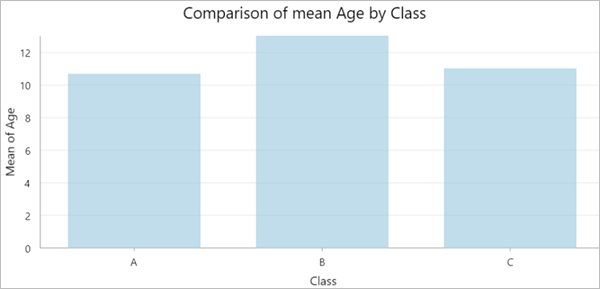
The By group category type displays values by category. This chart relies on data aggregation to create a category. It groups features or records into different categories based on the values of a specified category field. It depicts statistical values of one or multiple fields for each category. Each data point in the series chart or pie chart represents a statistic value (count, sum, average, minimum, or maximum) of a field grouped into categories. For example, with student data that includes fields for Name, Class, Gender, Age, Exam1, and Exam2, you can use the Class field to group data into different categories in the chart, such as calculating the mean for the Age field values for each Class category.

By field
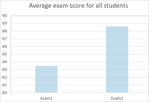
The By field category type displays attribute values as charts, depicting statistical values of all features or records for a specified field or fields. One or more numeric fields are specified to represent the categories. For each field or category, a summary statistic is calculated to create a data point. Using the same data as the previous example, you can calculate and plot the average scores of Exam1 and Exam2 for all students.

Interaction options
Charts present the statistics of the source data. To interact with other widgets with the same source data as the chart, you can add actions in the Action pane. For example, select a chart symbol, such as a bar, and show the corresponding features in a Map widget and List widget. To do so, click Message action and add a trigger for Record Selection Changes. Select Framework, and choose Select Data Records. The trigger data is the chart statistics output, which you can add as the data that the trigger will work on. Configure it with the trigger field from the trigger data, and action field from the action data to connect the trigger and action data. Once connected, any selection from the chart statistics triggers a selection action in the source data. You can also configure Data action in charts to view the statistics in a Table widget.
Tip:
The matching field should be identical between the chart output statistics and the source data to build the action connection. Chart statistics data generates a new OBJECTID based on the results, which is not the same unique ID in the source data. For best results, use the category field you used to configure the chart.
Note:
Apart from framework-level selection or filtering actions, which affect any widget using the same data source, currently, the Map widget supports Flash and Filter actions for a Chart widget's message.