ArcGIS GeoPlanner dashboards include pie and column charts. Each dashboard chart contains a primary and secondary chart. Primary charts display the distribution of feature types in a polygon, polyline, or point scenario layer or polygon feature layer with a unique value renderer. Secondary charts display a summary of assessment layer features that lie beneath the features modeled in the primary chart. The summary displays how each feature type overlays with an assessment layer. Assessment layers can be weighted overlay models or result layers from spatial analysis operations.
Charts are dynamic and update as you add, modify, and delete design features.
Chart statistics
Charts are qualitative in that they report on the characteristics or composition of a design or plan. Primary charts report on the types of features in a plan and statistics about those features. A primary chart displays statistics on a single design layer or any other polygon feature layer with a unique value renderer. Layer geometry type controls the statistic that displays in the chart. The design layer geometry type can be polygon, polyline, or point. The following table displays the types of statistics that a GeoPlanner primary chart can display based on a layer geometry type.
GeoPlanner chart statistic types
| Design layer geometry type | Statistics in primary chart | Statistics in secondary chart | Example |
|---|---|---|---|
Polygon | Feature area, length, count | Feature area, length, or count in assessment layer feature type | Acreage on silt loam soil type |
Polyline | Feature length, count | Feature length or count in assessment layer feature type | Length of highway that crosses a wetland |
Point | Feature count | Feature count in assessment layer feature type | Number of libraries in a 10-minute walk to a school |
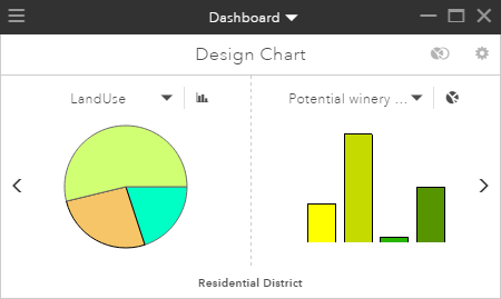
The following dashboard displays a primary chart for a land-use polygon design layer. The secondary chart shows a summary of an assessment layer beneath those land-use features.

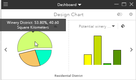
Hovering the mouse pointer over the large, light-green pie chart wedge displays more information. In this example, it displays the number of acres dedicated to this type of land use (Winery District) and its percentage of the total land use. Colors and symbols used in the charts are read from the symbols in the layer listed in the Dashboard drop-down menu.

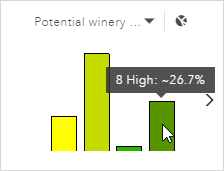
Clicking the Winery District pie wedge displays a summary of assessment data beneath those land-use features. Assessment layers help you understand the suitability for a development activity in an area. In this example, the assessment data shows the suitability for growing grapes in the study area. Clicking the Winery District pie wedge displays an overlay of the Winery District features on the assessment layer. The result displays in the secondary chart and shows how suitable the Winery District features are for growing grapes. The following image shows the secondary chart, with the bars in the chart representing suitability. Shades of deeper green indicate higher suitability. As with the primary chart, you can hover your mouse pointer over a pie wedge or column to view statistics. In this case, approximately 18 percent of Winery District features reside on land that is highly suitable for growing grapes. Colors and symbols used in the charts are read from the symbols in the layer listed in the drop-down menu above the secondary chart.
Note:
Clicking a type in the left side chart also highlights all features of that type on your map.

Tip:
By default, GeoPlanner displays statistics in a chart for visible features. To view statistics for all features in a scenario, open Dashboard Settings and set charts to report on all features.
Design Chart mode
When you initially click Dashboard  on the map, GeoPlanner displays the chart designer. The chart designer is a default view of a chart in the dashboard. It displays the most recent geometry type (point, line, or polygon) you edited in the design layer. Design Chart mode is dynamic in the following ways:
- It updates as you add, modify, or delete features in the design layer. This is also true of any GeoPlanner dashboard chart or gauge.
- It switches to the active editable geometry type if you change from editing one geometry type to another.
The chart designer browses for an assessment layer to represent in the secondary chart. If no assessment layer can be found in the Contents pane, the secondary chart indicates You do not currently have any valid Assessment Layers in your map. You can also configure the design chart to report using specific assessment layers. At any time, you can persist the active state of the design chart to a new chart. The new chart retains the settings you've configured.
Chart view settings
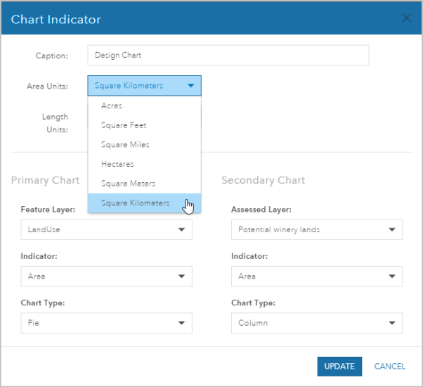
You can use Settings  in the design chart to access the Chart Indicator configuration dialog box. This dialog box allows you to make Chart Indicator configuration changes, including the following:
- Add a title or caption for the chart.
- Set area units for polygons.
- Set length units for polylines.
- Set the primary chart's feature layer. This can be any design layer or any polygon feature layer with a unique value renderer.
- Set an indicator for both primary and secondary charts.
- Set a chart type for both primary and secondary charts.
- Set an assessment layer for the secondary chart.
Create a chart
The following steps detail how to open the GeoPlanner dashboard, make chart configuration changes, and use those changes in a new chart.
- Ensure you have added polygon features to a design layer and create an assessment layer.
- On the toolbar on the map, click Dashboard
 to open the dashboard.
 - Click Settings
 to display the Chart Indicator configuration dialog box.
 - Click the Area Units drop-down arrow and choose Square Kilometers.

- Click Update.
- Click the Save Chart Indicator As button.

- On the Save Chart Indicator As dialog box, type a name for the chart.
- Click Save.
The dashboard's title bar changes to the new name. You can use the arrows on the dashboard to scroll through your charts and gauges. You can also click the title bar drop-down menu and choose an item to display.